The Profiling Labs are based just down the road from us in Paulton, Radstock. In fact one of their developers used to work with us, so it was a pleasant surprise when we discovered Lyndon (our ex-employee) would be briefing us in on what they wanted.
Growing.
The Profiling Labs specialise in targeting specific business leads. Over the years have developed their own platform for doing this. As the platform has grown, so has their client base. Not only grown in size but also grown in terms of the type of client they now attract – large blue-chip corporations.
Time for a change.
Their last logo design done the job and had successfully communicated their values to this point, but with bigger clients requiring their service they felt the need to commission a new logo design that looks even more professional and can sit alongside a development programme that will see them well into the future.
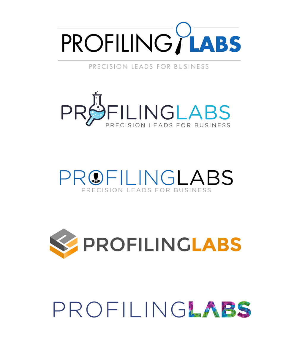
Logo design concepts.

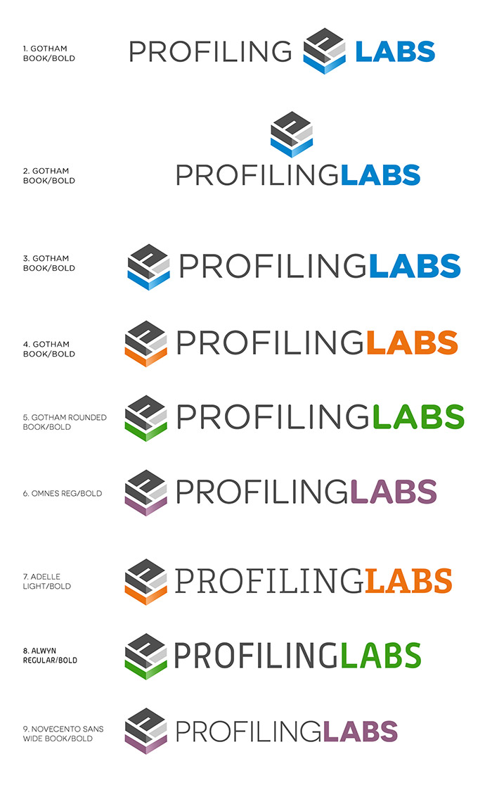
The concepts shown above have been selected from various stages of the logo development. The client chose a favourite and we took it to the next stage. The next stage included looking at various colour ways, fonts and adjusting the graphic icon element slightly.

The final logo design…
The final logo design has been selected from the last development stage shown above. It combines two font weights and two colours. The colours in each part of the logo (font and graphic icon) are directly related to each other. The cube represents a profile package that is delivered via the The Profiling Labs custom platform.

“Thanks Rod, the whole team are really pleased with the finished logo. We can now take our brand and service to the next level with confidence”
Attracting new markets and need to improve your image. Chat to us about your brand – contact us here or call 01823 765171.