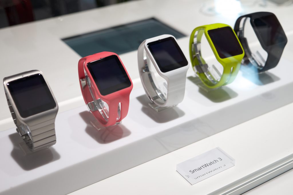
The smartwatch world is slowly building pace with many companies starting to bring out their own smartwatches. But with the slow moving start to the smartwatch industry, how are companies going about designing their apps for smartwatches?

One of the first processes in designing a smartwatch app is to make sure you follow platform design guidelines. Apple and Android are the two most popular platforms out there with well-documented user interfaces and interaction patterns. By designing your app to use these interactions, you will make your app far more user friendly.
An important consideration is how the user will interact with the watch. People will need to lift their arm and reach across their body with their other arm to use the smartwatch. So keep the interaction with the device as simple and quick as possible to make it user friendly. The key is to run tests and tweak the design where appropriate.
Next, consider the gestures you want the app to use. While using novel and fun gestures can make an app more engaging on a smartphone, an app on a smartwatch needs to be simple and memorable above anything else. Consider using gestures that are already built into the watch as the user will be familiar with those.
Keep the content short and concise. You are designing for a much smaller screen so your content should be scannable and understood in a matter of seconds. Making it longer may make the user friendliness suffer despite all your hard work in designing the app to be user friendly.
If your smartwatch app is to be paired with a smartphone app that features the ability to collect points or redeem coupons, for example, consider the ability to use the watch on its own. Imagine the frustration the user would have if their watch notified them that to use a function they would have to pull out and use their phone to collect points, redeem coupons or pay for an item.
Be careful with your alerts. While some users won’t mind be alerted for every reason possible, the vast majority of user will find it annoying. Allow the user to set which alerts go to their phone and which go to their wrist via the settings.
Finally, don’t see the smartwatch as a small smartphone. While you want to bring the complete experience to your user, don’t just reproduce all your content for a smaller screen. Keep your content and design simple and focused to avoid frustrating users and them deleting your app.
This is just the beginning of the smartwatch revolution. As more and more become available, the more we will learn about how to design for them.