Responsive Websites
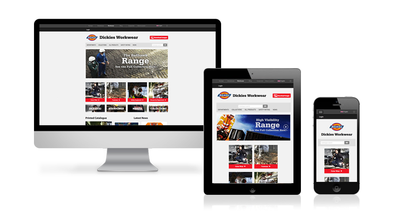
Definition: A responsive website is a website that adapts its layout according to the screen size that it is being viewed on, as opposed to a traditional fixed width website that is simply shrunk to fit small screen sizes. A well designed responsive website is easier to navigate due to the navigational elements and other website content being adapted to best suit each screen size the website is viewed in. Why websites need to be responsive.

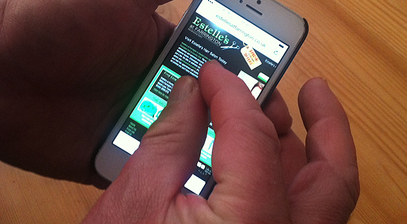
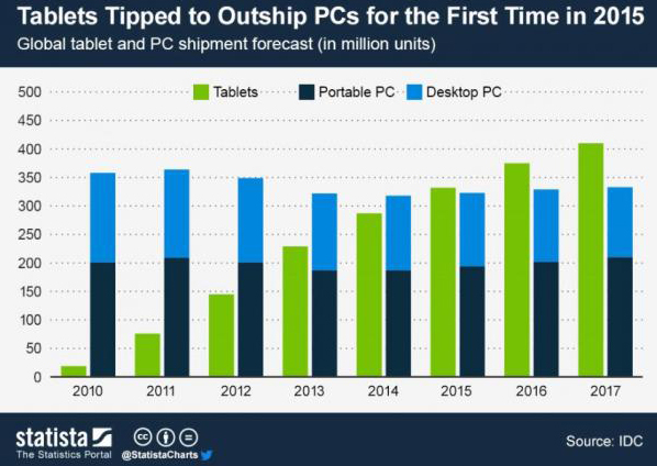
The need to go responsive is now greater than ever. Smartphones and tablets are becoming ever present in day to day life and it is said that there will be more tablets sold than PCs by the end of the year. The obvious need for busy people is being able to carry their work with them so they can work from anywhere, whether this be on the train home or whilst they’re abroad on holiday, it is a lot easier to carry a tablet around than it is a desktop or even a laptop. So what does this mean for those who need a website for their business? Well it is fairly obvious, go responsive. With the chances now much greater that a user will visit your site using a mobile or tablet rather than a PC means having an un-responsive website will make it challenging for any user navigate website. The reason being, the user will almost certainly have to pinch and zoom, press small buttons and this could cause them to accidentally click a link before they’ve even had the chance to look at the page they are on. They then will have to reload the page which could take longer than usual since your website hasn’t been optimised for their device. The chances are, they will become frustrated with the whole experience and have left your website and gone looking elsewhere. End result – Business lost!

So how can we say that mobiles and tablets are more common to access the web on? Well one way is numbers of devices out there. LukeW site has this mini article siting the number of Android and iOS devices out there. This article states that in July 2012 there were 1 billion PCs powered by Microsoft. In September 2012 there was a combined 880 million Android and iOS devices. As of July 2013 there are 1 billion devices running Android and 600 million devices running iOS. That is a combined 1.6 billion devices that aren’t PCs. Of course the PC statistic doesn’t include systems running Apple and Linux but these won’t be anywhere near 600 million to match the total number of mobiles and tablets out there.
“Within 24 hours 18% of iOS devices were running iOS 7 and within 3 days the number iOS 7 devices was greater than that of iOS 6.”
Another way to tell how many users are using devices other than PCs is how quickly users update their devices. With the recent release of iOS 7, it is an ideal time to see the stats about how many people upgraded their iPhones, iPads and iPods. This Article, again by LukeW, has the statistics.

My earlier statement about tablets will out sell PCs by the end of the year was suggested by BBC correspondent Rory Cellan-Jones. He was taking a look at a new tablet that will be hitting the market very soon. It is called the Hudl and has been released by Tesco. Yes Tesco has decided to enter the harsh battle amongst the big boys for domination of the tablet market. Tesco is obviously not renowned for its electrical products but rather food, however Tesco is hoping that their well known and trusted name will prompt buyers into purchasing this device. If this device, which is high spec for its price, takes off then Rory’s prediction could easily happen. For more about Tesco’s Hudl check out Rory’s article here. This really does promote the idea of getting a responsive website. A user will want a website that is optimised to their device, so if your website isn’t responsive then they are more than likely to leave your site and go elsewhere!
Contact us, SketchCode Studio, to go responsive today!
Further reading – Why websites need to be responsive