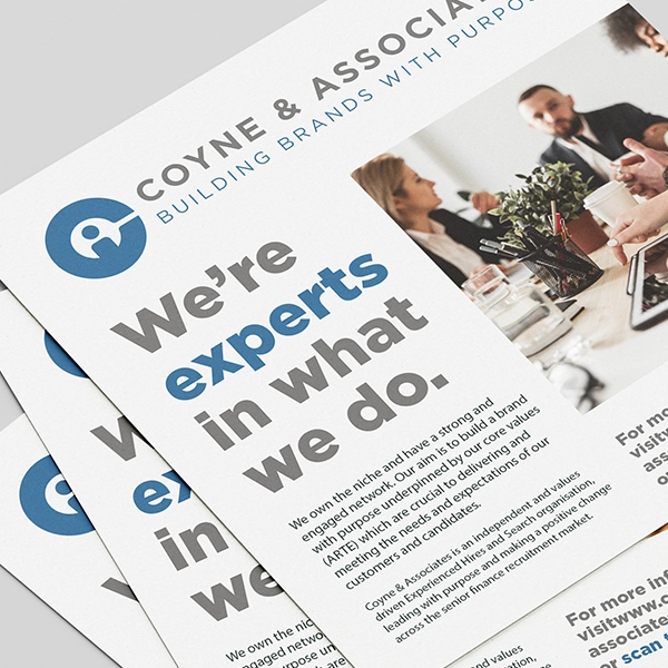
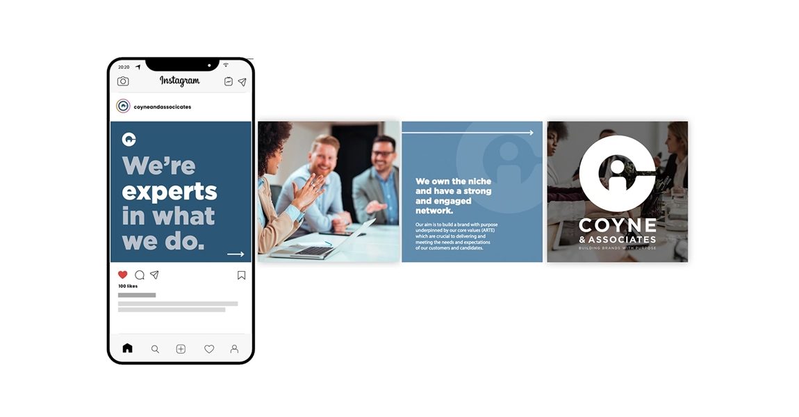
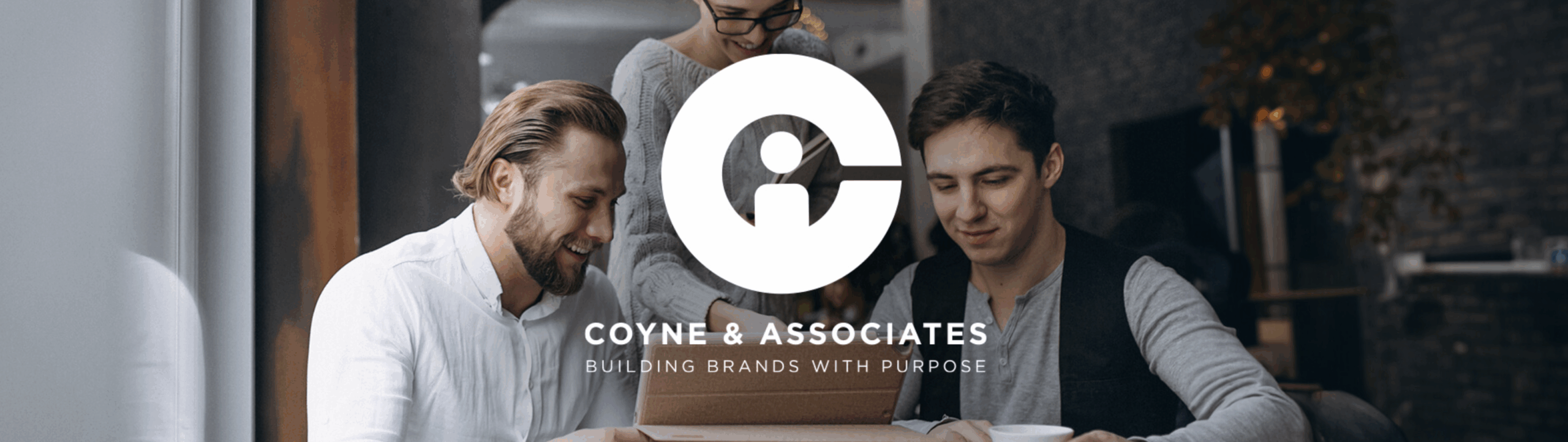
Coyne Associates is a recruitment agency focused on connecting top talent with the right opportunities. When they approached us to develop a logo for their brand, the goal was to create an identity that felt professional, modern, and intuitive, reflecting both the search-driven nature of recruitment and the people-first focus of their work.
Icon Concept
The final logo design is a clever fusion of symbolism and simplicity. At its core is the letter “C”, representing Coyne, which also forms the outline of a magnifying glass, a direct reference to the act of searching and selecting the right candidates. Within the negative space of the magnifying glass, we placed a simple human figure. Together, the person and the lens subtly form the letter “A”, completing the initials “C” and “A” in a single, unified mark.
This concept-driven approach makes the logo not only highly memorable but also deeply relevant to the services Coyne Associates provides, placing people at the centre of every search.
Typography & Style
The accompanying typography was chosen for its clarity and contemporary feel. Clean lines and a balanced structure ensure the brand remains professional and versatile, suitable for everything from digital applications to corporate print materials.
Colour Palette & Mood
The colour palette was kept refined and confident, using tones that suggest trust, clarity, and precision; key qualities in the recruitment sector. The simplicity of the palette allows the icon to take centre stage while remaining versatile across various touchpoints.
Brand Impact
This identity is built on smart visual storytelling, bringing together the ideas of discovery, people, and purpose into a clean, professional mark. The result is a logo that communicates Coyne Associates’ values at a glance: thoughtful, human-centred recruitment, delivered with precision.