Crossman Associates, an environmental surveying company based in Somerset, approached us for a brand identity that would reflect the precision and purpose of their work. Specialists in conducting ecological surveys for protected species such as great crested newts, bats, reptiles, and badgers. Their services are often essential steps before new housing developments can proceed. The challenge was to create a logo that combined clarity, meaning, and versatility while staying true to their ecological mission.
Icon Concept
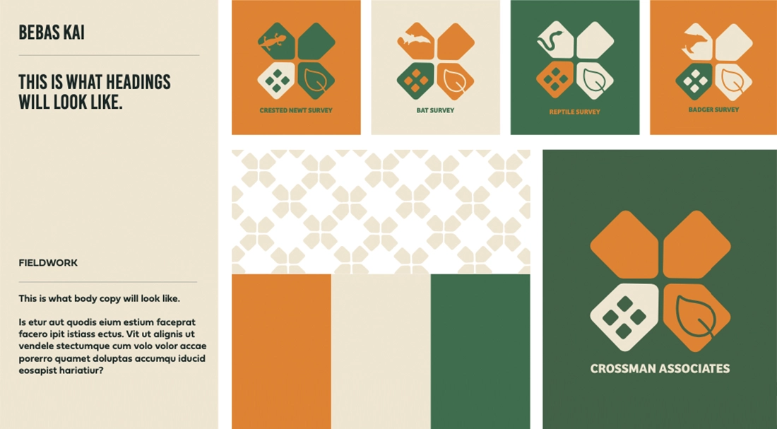
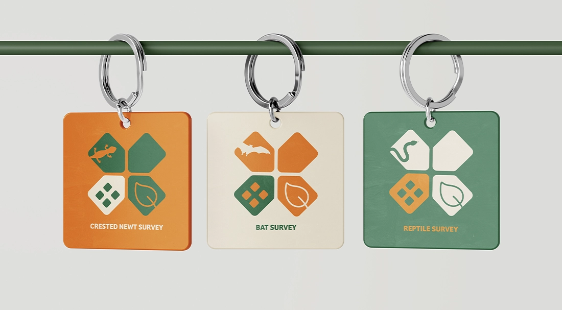
The core of the logo is a cleverly constructed cross, visually referencing the “Crossman” name, built from the geometric shapes of four interlocking houses. This subtle nod to the housing and development context of their work adds an extra layer of relevance to the design. Each variation of the logo then integrates animal icons representing the protected species they survey, including great crested newts, bats, reptiles, and badgers. These species are seamlessly incorporated into the cross, making the logo informative as well as visually distinctive.
Typography & Style
To support the symbol, we selected clean, modern typography that balances authority with approachability. It complements the icon without overpowering it, ensuring the brand retains a professional tone across a wide range of materials, from technical reports to marketing material.
Colour Palette & Mood
The colour palette combines a strong, earthly green, symbolising ecology and environmental awareness, with an energetic orange that brings a sense of momentum and commercial drive. This contrast creates a dynamic but balanced feel, representing the intersection between nature and development. A third soft pastel tone introduces a calm, grounded quality, providing contrast without conflict. Together, these colours create a complete visual package that feels strong, professional, energetic, calm, and trustworthy, reflecting the dual focus of Crossman Associates’ work in both ecological expertise and practical application.
Brand Impact
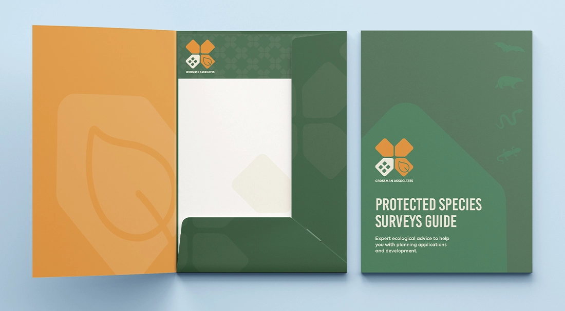
The final identity is smart, functional, and packed with meaning. It communicates the company’s specialism in both ecology and pre-development surveying, while providing a flexible logo system that’s ready to be used confidently across all touchpoints, from business cards to PPE.