The Clipper Restaurant, located in Poole, Dorset, approached us to create a brand identity that reflected both its coastal location and its focus on quality dining. The challenge was to design a logo that captured the restaurant’s nautical namesake while clearly communicating its place in the food and hospitality industry. The result is a clean, concept-driven logo that weaves together maritime character and dining symbolism in a subtle, elegant way.
Icon Concept
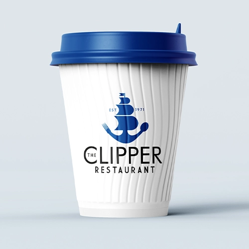
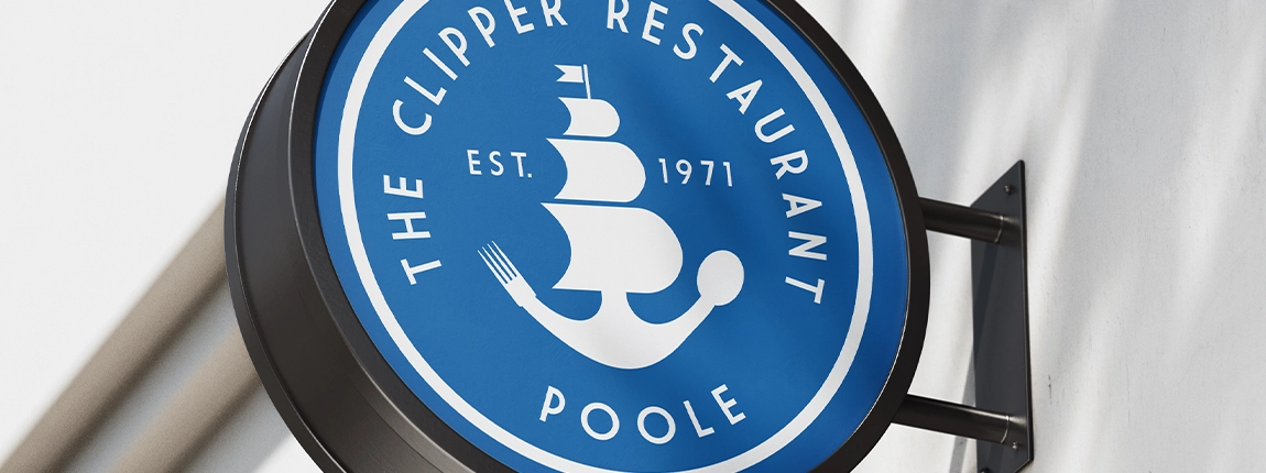
At the heart of the design is a cleverly constructed icon that merges a fork, spoon, and a clipper ship into one cohesive symbol. This dual-purpose visual speaks directly to the restaurant’s name and its offering – serving fresh, flavourful food in a location tied closely to the sea. The cutlery subtly forms the bow and stern of the clipper, creating an image that’s instantly recognisable while rewarding closer inspection with thoughtful detail.
Typography & Style
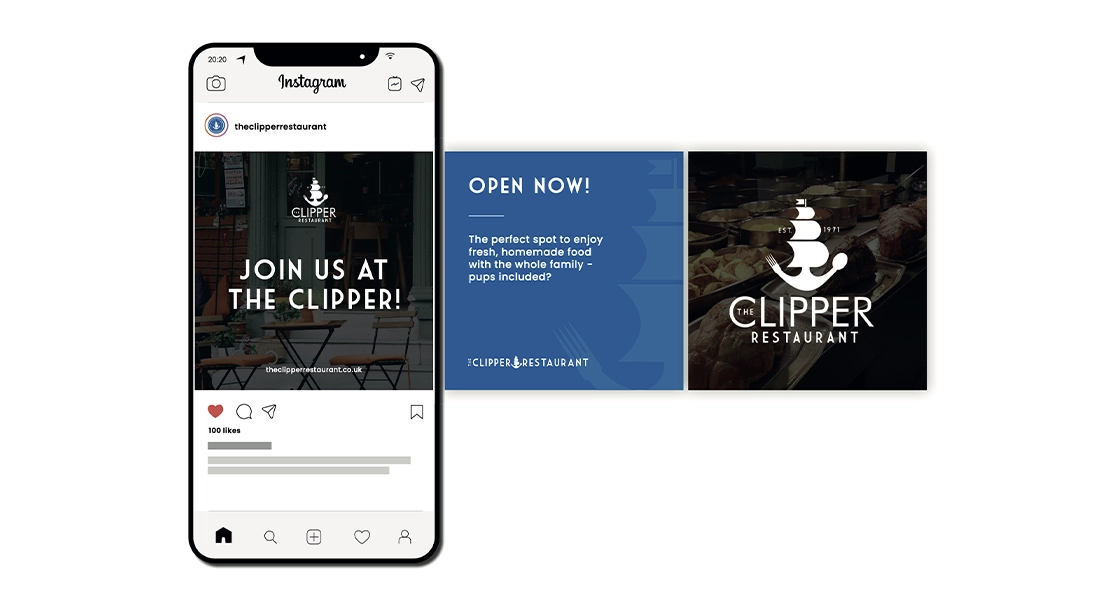
The accompanying typography was chosen to reflect both sophistication and approachability. It’s clean and modern, yet with subtle cues that nod to classic maritime aesthetics. The type supports the symbol without overpowering it, ensuring the brand remains versatile across signage, menus, and digital applications.
Colour Palette & Mood
The nautical theme is reinforced with a carefully selected palette of ocean blues, muted greys, and crisp whites. These colours not only evoke the seaside setting but also help position the restaurant as a fresh, welcoming destination with a sense of coastal charm and calm refinement.
Brand Impact
The final identity balances creativity with clarity, resulting in a logo that feels rooted in place and purpose. It gives The Clipper Restaurant a unique, professional presence that’s memorable, meaningful, and ready to sail confidently across everything from uniforms to Instagram.