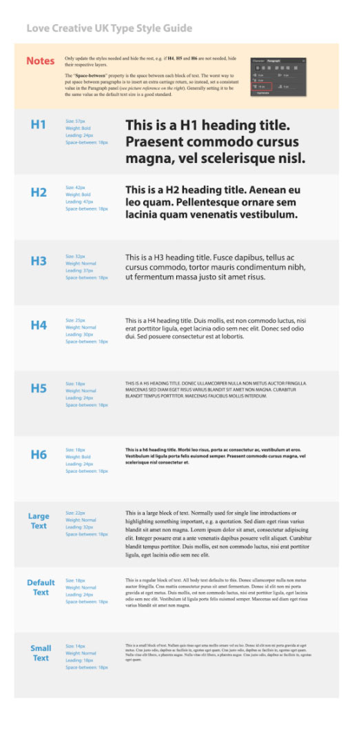
A type style guide, I hear you ask. What is that? Why do I need one? Who’s going to use it? Can I not just use my head to remember everything? Questions every designer asks their developer when they bring up the subject.

As anyone that works in the design industry knows, style guides can be a life saver. They store all the information you need to remember for a project that you haven’t touched in months. However, they are somewhat time consuming and more often than not they aren’t completed, leaving future you to deal with the problem.
So what exactly is a type style guide? Well basically it is what it says on the tin. It is a style guide for all your type needs. What a type style guide allows you to do is to keep note of what each variety of text style you have on a given project. This means as a designer you won’t have that pesky developer tapping on your shoulder asking you should the header font be 57px or 15px because photoshop has done that strange thing where the fonts say they are different sizes but are somehow the same actual size. Of course not your problem because the developer should know photoshop does that to your visuals by now.
What to put in your type style guide
Well HTML defines six levels of headings. A heading element implies all the font changes, paragraph breaks before and after, and any white space necessary to render the heading. The heading elements are H1, H2, H3, H4, H5, and H6 with H1 being the highest (or most important) level and H6 the least. Of course each project will vary and you might not even have all six heading elements. So for each project just include the heading elements that you will be using. Unless you want to annoy your developer that is. In which case add them all in and don’t tell them that some aren’t used. That should keep them on their toes.
Along with the heading elements include the information for large text, default text and small text sizes. I mean yeah it is probably easier just to tell them after they have coded it all and added the content. Wait, actually yeah that probably is easier … but then again they will probably bug you about it when you’re trying to take that perfect Instagram picture you’ve been working on for the past two hours. Probably best to add it in then.
Reluctantly you agree to put all the information about each style into a helpful type style guide for your developer but no doubt they want lines and lines of information. Luckily for you though they only want 4 key pieces of information for each style; font size, font weight, leading and space-between. That is all a developer wants. You could be super nice and provide them with an example of what it looks like too. Perhaps useful when you drop them a two day turn around on their desk.
It is really that simple. By creating a type style guide you are setting a definitive style (size/leading/weight) for each heading size which ensures a constant approach to using type throughout a project. Plus you could make it like super pretty. You did go to art school after all.