Website case study:
Somerset Cheese Co.
CASE STUDY: Website redesign
SketchCode Studio were asked by the Somerset Cheese Company to redesign their website, and we thought it might be useful to write up a website redesign case study that allows people to see how we approach projects and the benefits that having a website redesigned can bring.
When the Somerset Cheese Company came to us, they already had a live site that was generating business and which allowed them to sell their cheeses online. Our task was to update the site so that it would put them ahead of their competitors, improve their conversion rates and to make better use of modern web technology, such as responsive design so that they could cater for the ever increasing number of people who are using their mobile and tablet devices to browse the web.
Before getting stuck into wireframing and creating design concepts, we decided to take a look at their existing website’s analytic data and visitor flow to gain an understanding of what the popular pages/features on the site were, as well as looking at similar sites in the cheese industry to see what the Somerset Cheese Company’s competitors were doing.
This user research and data gathering gave us the insight into how people like to use their site, and what type of features should be brought to the fore on the new site.
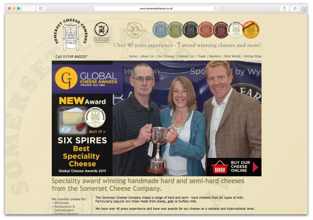
A few of the things we highlighted as weaknesses of the old site’s homepage were:
- Small menu links made the site harder to navigate and it was easy to miss them
- Not enough emphasis of the individual products being sold – the main image didn’t feature cheese
- Default text size was too small for easy reading, and there wasn’t enough spacing in-between different elements which made the design feel busy and cluttered.
- Not enough clear Call to Actions (CTAs) to encourage visitors to explore the rest of the site.
- The site was not responsive, which meant it did not display very well on small devices, such as mobiles.
Visual creation
When we got on to the design visual stage of the project, we started by playing around with different colours to established a suitable colour palette for the site
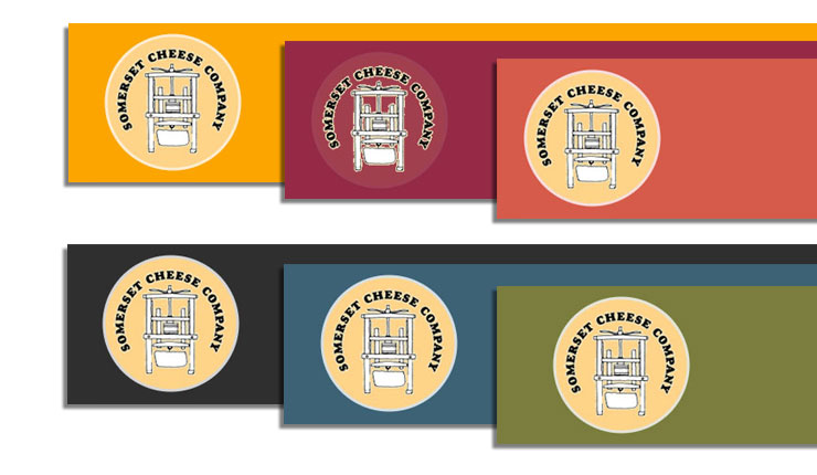
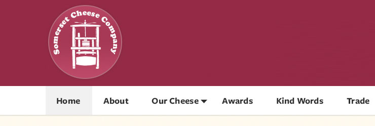
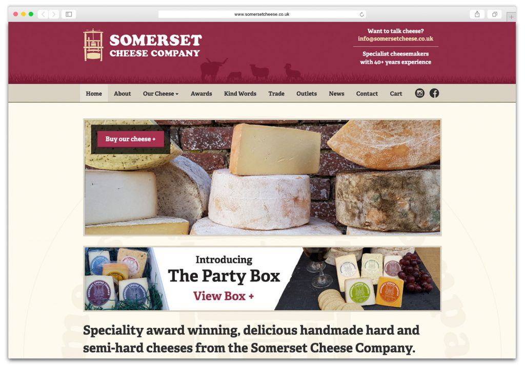
We settled on using a light burgundy colour for the header background as it’s a colour associated with the Somerset region, with it featuring on both it’s cricket and rugby team kits.
The next element we wanted to nail down was the typefaces to use on the new site, and after testing various examples, we settled on a mixture of Adelle for headlines and Proxima Nova for the body text. We liked Adelle as it has a formal, yet friendly personality, which enough character to hold up to the somewhat perceived, rustic nature of cheese making, while Proxima Nova straddles the gap between typefaces like Futura and Akzidenz Grotesk. The result is a hybrid combining humanistic proportions with a somewhat geometric appearance, which makes it easy to read at multiple sizes.
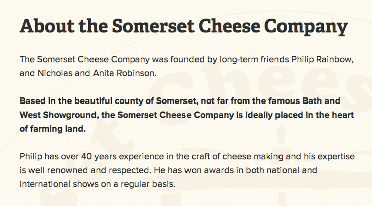
With both the colours and typefaces sorted, we moved on to producing an initial design visual of the website homepage as we wanted to be able to get some feedback from the client and get them involved in the design process as soon as possible. We find that doing this results in less chance of clients rejecting our website design concepts outright, as they’ve had a direct hand in what elements go into it.

One of the elements we weren’t keen on of this was their existing logo, but we weren’t sure if this was something that would be feasible to change as they’re an established business. Luckily after talking things through with them, they were in agreement that the logo should be updated too, so along with a various other bits of feedback we slowly evolved the design of the site until we settled on the final version you can see below.
Want us to improve your website? Call 01823 765171
Improving the user experience
From our initial research, we could see that one of the most confusing areas of the old site for users was the single product page. The layout of the page was poor, with several key elements, such as the basket having a very low hierarchy on the page, to such an extent that a significant percentage of visitors were adding products to their baskets and then leaving the site as they couldn’t find out how to complete the checkout process. We could also see that the social media buttons weren’t being used, so were an unnecessary addition to the page.
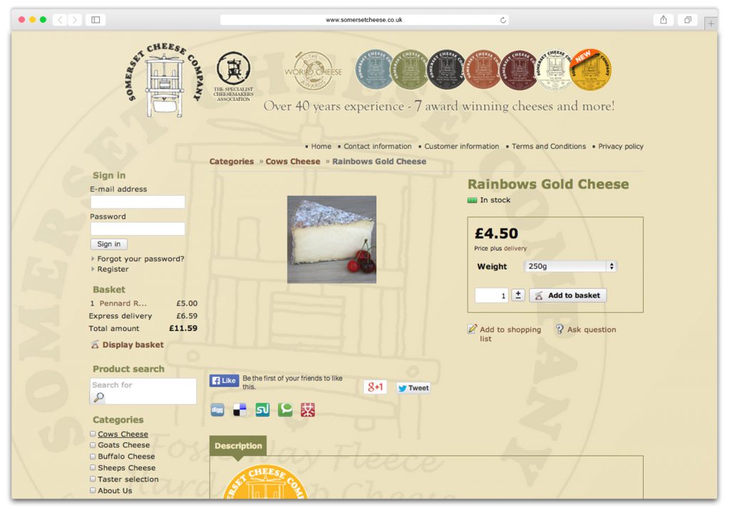
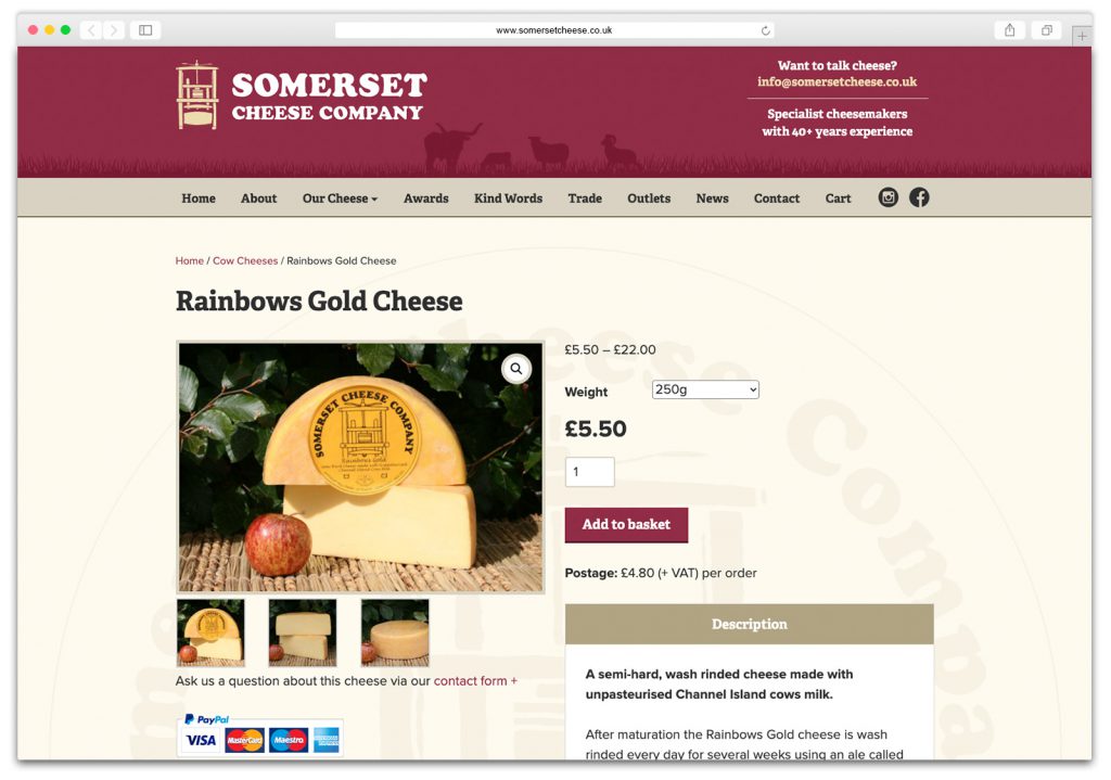
Our redesigned, streamlined version, removed any elements that weren’t being used, while adding in some extra photos of the cheese as we felt that potential customers would be more inclined to want to buy a cheese if they could get a good look at it. We also made sure that the balance and structure of the page was improved so that the content flowed together nicely.
Getting Technical
We also improved the site from a technical perspective, as it doesn’t matter how nice the design is, if it’s not performing fast and efficiently too. One of these improvements was the URLs as the old system had randomly generated page addresses which were overly long and obtuse.

The new URL structure follows a logical path of progression, so you should be able to tell what part of the site you’re on just be looking at it. This has SEO benefits, but also makes it easier for users to navigate around the site as it reinforces the site’s structure.

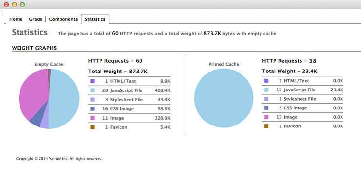
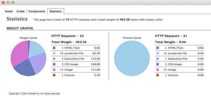
Page loading times and performance was another technical side of the site that we aimed to improve, so before the old site was taken down we ran multiple speed tests and noted down where the performance issues lay. We were careful to avoid such issues when building the new site, and as such, the new site performs much faster than the previous one did.
The results
So how did all this turn out, and is there a tangible benefit to making all of the aforementioned changes? Short answer, Yes! The site has seen a huge increase in visitors, and they’re now spending more time on the site as they’re looking at more of the pages. Even more importantly, the number of sales and enquiries are up too, but don’t just take our word for it, take a look at some of the stats below and see for yourself.
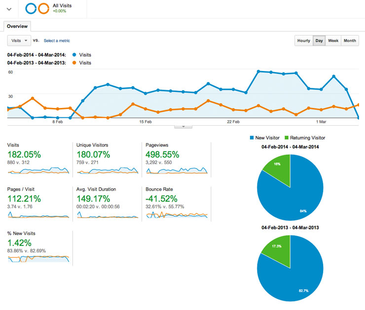
Overall we’re very happy with how this project turned out and writing up a website redesign case study has helped us to evaluate our approach to and it’s very satisfying to see the positive results of our hard work, and hopefully the client will be reaping the benefits of their redesigned website for several years to come.
If you’ve got a website or a web project you’d like us to take a look at then please get in touch with us via the details on our contact page as we’d be delighted to use our skills to help improve your online presence.

