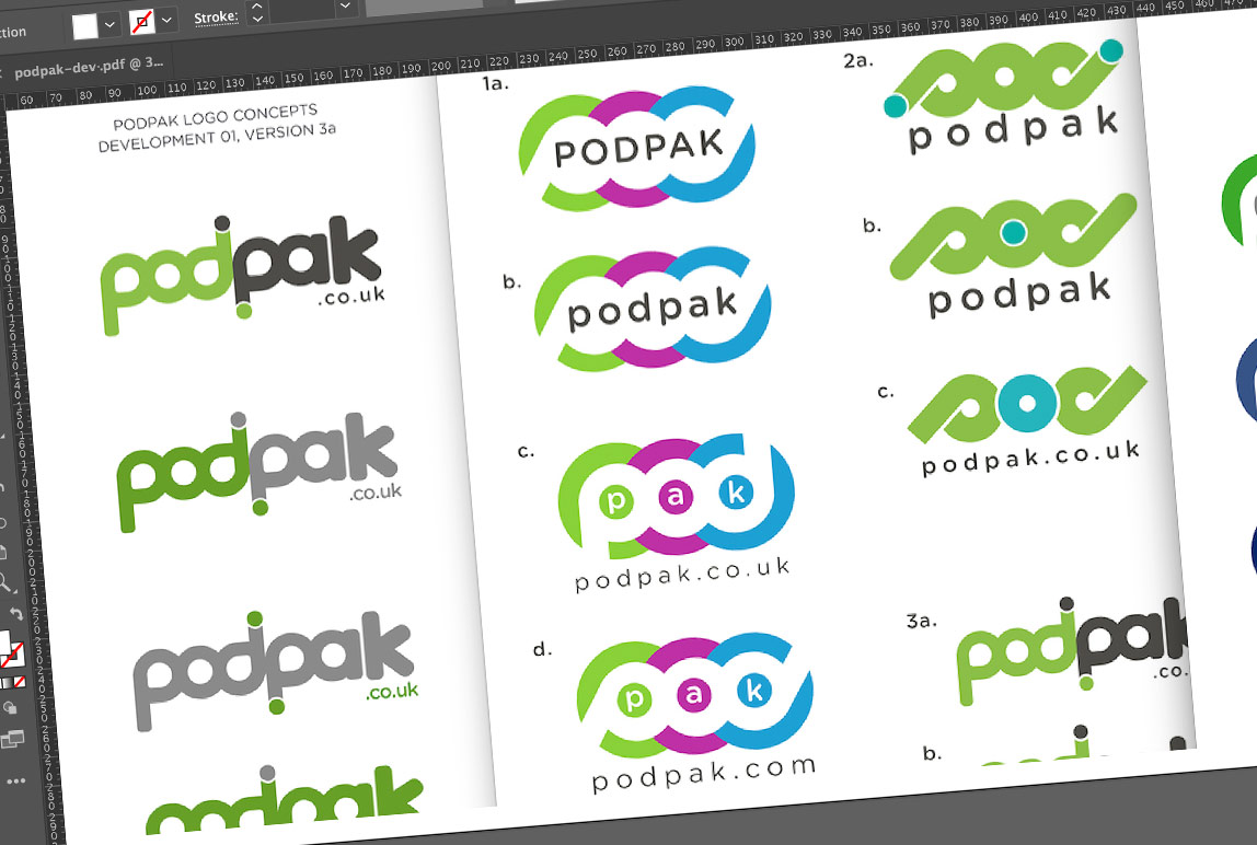
We got to work and created four PodPak logo design concepts. With each concept we experimented with various colour combinations, whilst also trying to establish a graphical representation of the pod itself.
Initial feedback was positive and Nick shared the concepts with his team. It wasn’t long after Nick and his team decided on a favourite concept. Nick briefed in his comments and amends. We carried out the amends whilst continuing to experiment with a few more different colours options. On completion of this stage we reached a final approved design that we were all in agreement with.
We supplied the final logo design in various agreed colour options – white, black and a colour version. We supplied file formats: .ai, jpeg, png and eps. The .ai and eps files are hi-res vector files used for print projects and can scaled indefinitely for large format printing. The other formats (jpeg and png) are primarily for online use.
We also produced and supplied a set of logo guidelines to show how the logo can and cannot be used. These are usually distributed to third parties who are usually partner organisations who wish to use the Podpak logo within their literature or online formats.
