Website case study:
Cleary Canines
A WordPress Website for Puppy Training Specialist Cleary Canines
The Client
Cleary Canines is Bristol’s puppy training specialist.
The Problem
Michelle set up Cleary Canines to help train puppies and has grown the business over several years. She’d used an online web builder to make her own website. As the business grew, it was clear that the site wasn’t keeping up with the high quality service she provides.
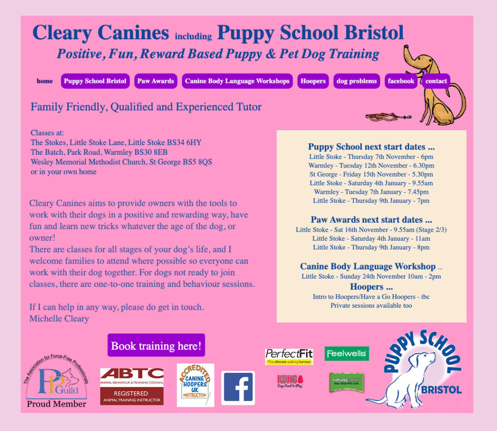
Knowing the website was the weak link in her business, she got in touch with us to see if we could help give her website a long overdue redesign.
As well as being a platform to reflect her upcoming brand, her website needed to serve two vital functions: as a destination for people seeking information on her puppy training courses and as an effective sales tool via an online store.
Looking through the analytic data for the old site, we could see that users were getting lost with the unclear navigation. Some were not able to find common things such as the cost for her courses or her contact information.
The Solution
We began the process by creating a new structure for the website, and then developing a series of wireframe layouts. These allowed us to show Michelle several concepts for the page layouts before settling on ones we were all happy with.
After the wireframes had been approved, we designed a few select pages in Adobe XD. This is so we can finalise some of the visual design essentials such as the typefaces and colour palettes.
We sampled the light brown from Michelle’s logo as part of the colour palette to help tie the new website in with the Cleary Canine’s brand.
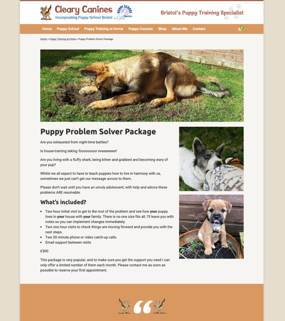
For the typefaces, we settled on Ubuntu for the headlines and Heebo for the body text. Ubuntu is an OpenType-based font family, designed to be a modern, humanist-style typeface by Dalton Maag. It works remarkably well on the web. It provides enough distinction between its various glyphs and letters to make navigating them really easy for users. Even ones who might have poor eyesight.
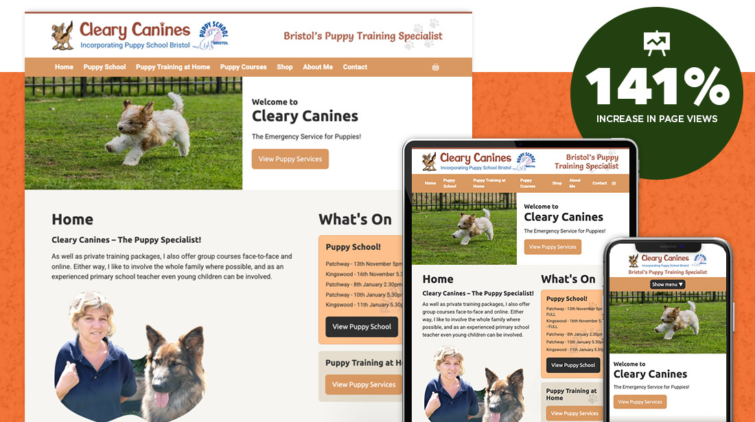
We designed a website that enables visitors to easy see what courses & services are offered by Cleary Canines. It’s also easy for Michelle to update the site herself so her list of courses and times are always up to date.
The simple navigation and large images encourage visitors to browse the website for the information they’re looking for.
The site was built in WordPress with a custom theme. This maintains a clean separation of content and code for markup, styling, and functionality.
We provided a free, two hour training session via Skype. This ensures that Michelle was comfortable with the system and understood how it works.
What happened next
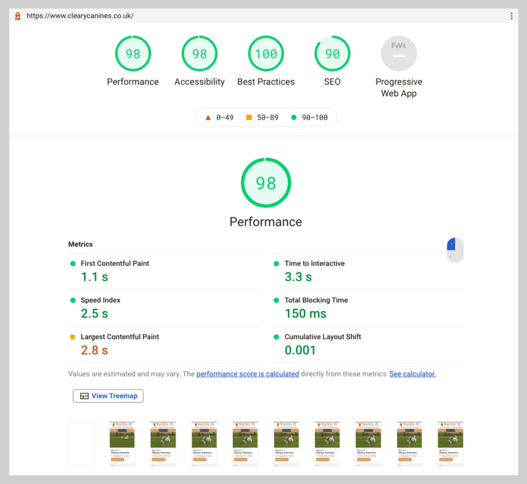
With a totally new design, a radically improved navigation and overall a much smoother & faster site, we hoped there would be some equally drastic changes in how people used and interacted with the puppy website. We’re pleased to report that so far all the changes have been for the best. Take a look at the stat report screens below to see for yourself.
