Website Case Study:
Durston House School
A WordPress website for London independent school, Durston House
The Client
Durston House is a leading London preparatory school, with a long history and a fine record of preparing boys for Senior School and future success.
The Problem
People increasingly expect to access online services in the same way they order their products from a large company like Amazon: with an effortless user experience, accessed through any of their digital devices.
Durston House knew their old school website was failing in this regard, and had a long way to go to meet that rising public expectation. In short, their website was long overdue a redesign.
As well as being a platform to reflect their established brand, their website needed to serve two vital functions: as a destination for people seeking information and as an effective sales tool.
Looking through the analytic data for the old site, we could see that users were getting frustrated with the complex structure of the site. They were finding simple tasks hard to achieve, such as not being able to find common things such as Term Dates or Entry Fees. School staff were also frustrated by outdated backend processes which meant a waste of time and money.
The Solution
We began the process by creating a new structure for the website, and then developing a series of wireframes to experiment with the page layouts.
After the wireframes had been approved by Durston House school, we designed a few select pages in Photoshop. This allowed us to establish the visual design fundamentals such as the colour palette and typefaces.
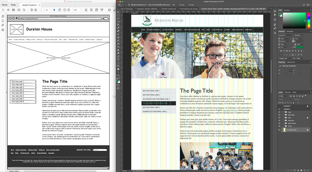
We sampled the Green from the school’s logo as part of the colour palette to help tie the new website in with the rest of the school branding.
For the typeface, we settled on Gill Sans for the headlines and Garvis Pro for the body text. Gill Sans is a British typeface that was designed to look both cleanly modern and classical at the same time. We felt it was a perfect fit for Durston House school.
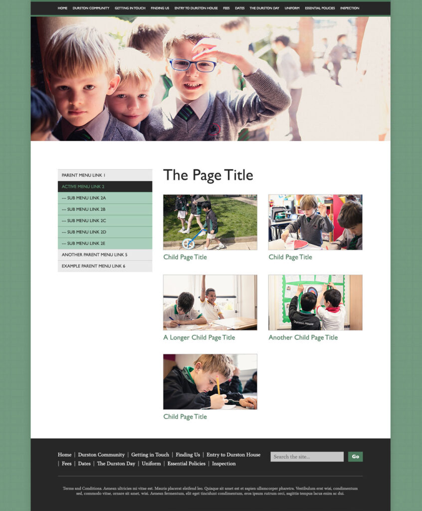
We developed a website that enables the user to explore what happens at Duston House school. The clear navigation and large images encourage users to browse the website for information.
The site was built in WordPress with a custom theme which maintains a clean separation of content, and code for markup, styling, and functionality.
We created user roles for staff responsible for managing the website to make their roles easier and more focused. We held training sessions to ensure that everyone was comfortable with the system and understood its objective.
What happened next
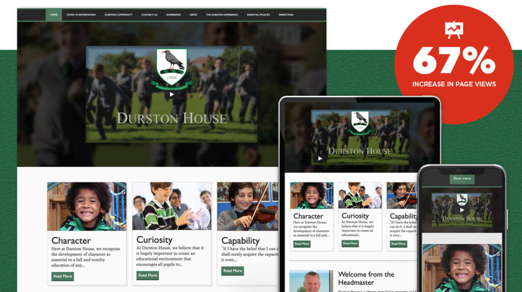
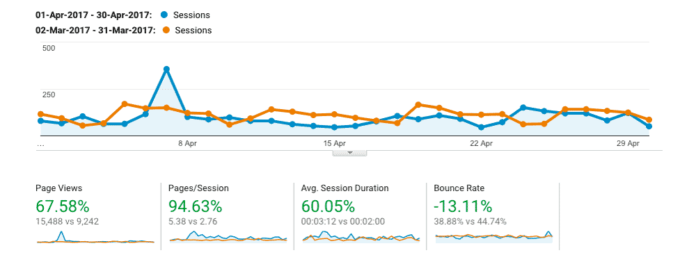
With a radical overhaul of navigation, functionality and visual design, we expected some equally drastic changes in how people used and interacted with the school website. We’re pleased to report that so far all the changes have been for the best. Take a look at the stats at the bottom of this page to see for yourself.
What the Marketing Manager said…
“When looking for a web design company to redesign our out-of-date and non-responsive website, SketchCode Studio stood out as the people we felt would understand our unique objectives. We made an excellent choice – SketchCode Studio helped us through every stage of the project, analysing our needs, adapting our ideas and advising us to the best use of the medium and the new web technologies. Their workflow was fast, and we hope to work with them again on future projects.”
Henry Ross. Marketing Manager. Durston House School
Other Schools:
We have other school websites we’ve designed as well, so let us know if you’d like more info. Our years of experience working with schools mean we understand their needs. If you’re interested in a new website for your school, contact us to see what we can do for you.

