Sympathetic Design
At SketchCode Studio we design responsive emails that display the same on a desktop as they do on a mobile device. The design is sympathetic to mobile so the email can be clearly read and requires no pinch and zoom. In our experience we find those emails that require pinch and zoom aren’t as successful. We believe this to be down to the fact that users have to search the email for information. The search leads to frustration and user moves on the next email in the inbox.
Fact: One of the more prominent frustrations of pinch and zoom is accidentally clicking a link you didn’t want to, and then it loading up whilst you’re reading the text you’ve zoomed in on.
Call To Actions!
As with any responsive email, call to actions or CTAs, are very important and it’s important that they appear in the right locations. Depending on the length of the email, CTAs appear at the top, middle and bottom to enable the user to click through at any point when reading the email. There is nothing more annoying than reading an email on your mobile and deciding that the information is for you and then having to scroll back to the top to click through.
Keep it simple
In our experience a responsive email that generates click-throughs have prominent CTAs, are simple, visual and communicate a clear customer benefit.
A recent so called “responsive” email we received…
There are some do’s and don’t’s when it comes to building responsive emails. This email (below) we recently stumbled across uses divs and media queries. Without getting to technical these are methods used to create responsive websites viewed in web browsers and not in email clients or in webmail. Below is how the email looks in Apple’s mail client, Mail.
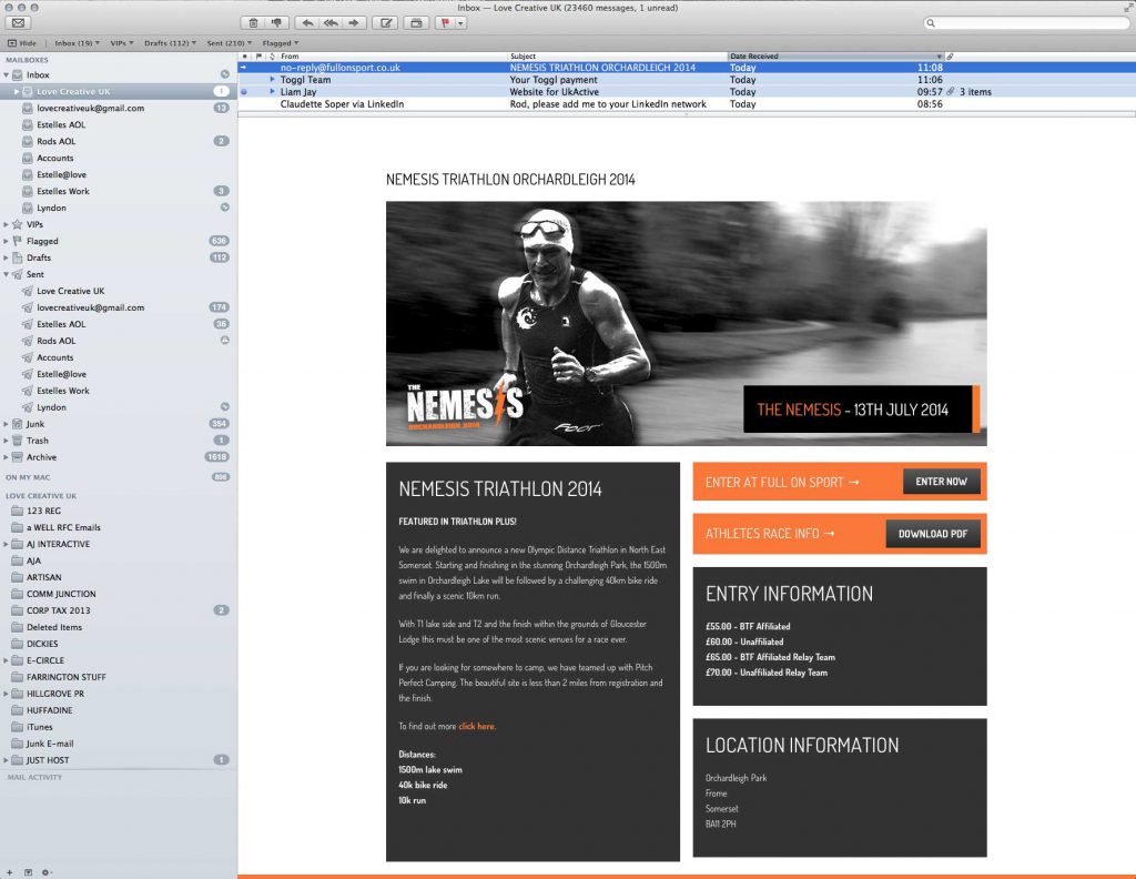
As you can see the email looks absolutely fine. In actual fact it is a very nice email to look at and read… on desktop. They’ve kept it clean and simple with CTAs in plain sight and in key locations. The text split in to different boxes, so key information like entry cost and location are clearly visible. This email has all the makings of a great email, so lets see how it performs in other mail clients (since Apple’s Mail isn’t the only one out there).
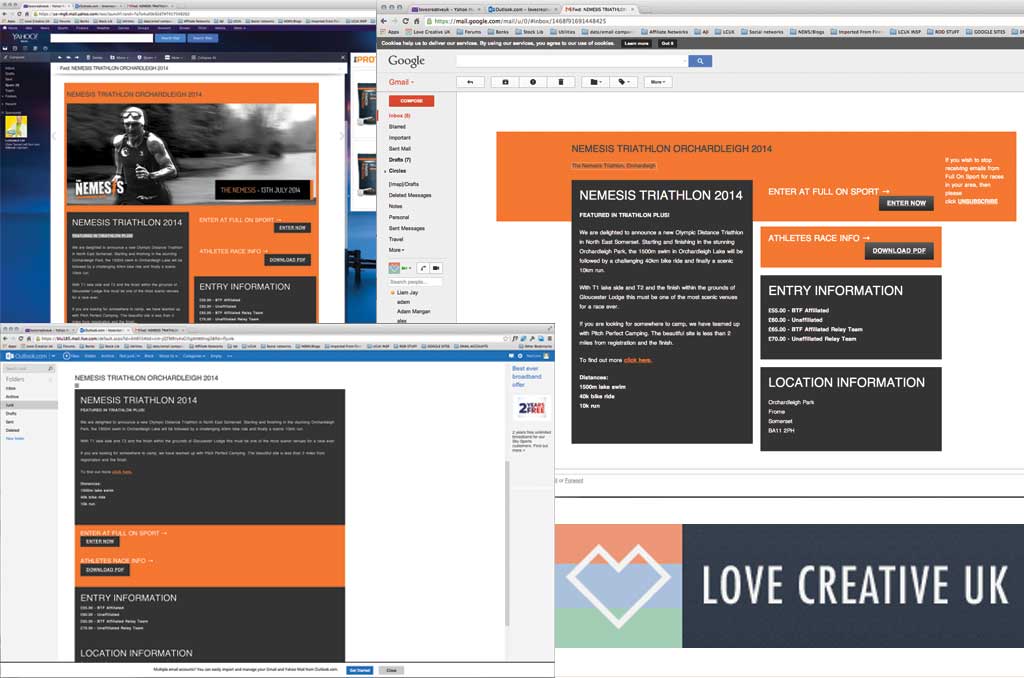
We tested this “responsive email” in the main webmail clients – Gmail, Yahoo mail and Outlook. As you can see Yahoo mail is the least broken out of the three. Gmail and Outlook are completely broken, looking nothing like the email that you see in Apple’s mail client. It has literally fallen apart and as such users are more likely to junk or bin this email since it just doesn’t look credible.
Lets test this email on a mobile device

We first looked at this responsive email on desktop and scaled it down to size for both mobile and tablet. We used Apple’s Mail client, and it proved that this email was built responsively but the real test is to see what the email actually looks like on a mobile or tablet. Could this email save itself yet?
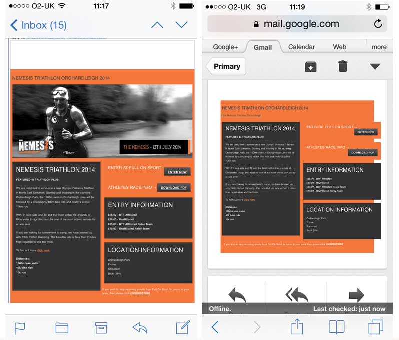
We tested the email on mobile in Apple’s Mail and Gmail. As you can see it is broken in both. In fact this email on a mobile isn’t responsive at all. In mobile view it is just a scaled down version of the desktop view, so one is required to pinch and zoom.
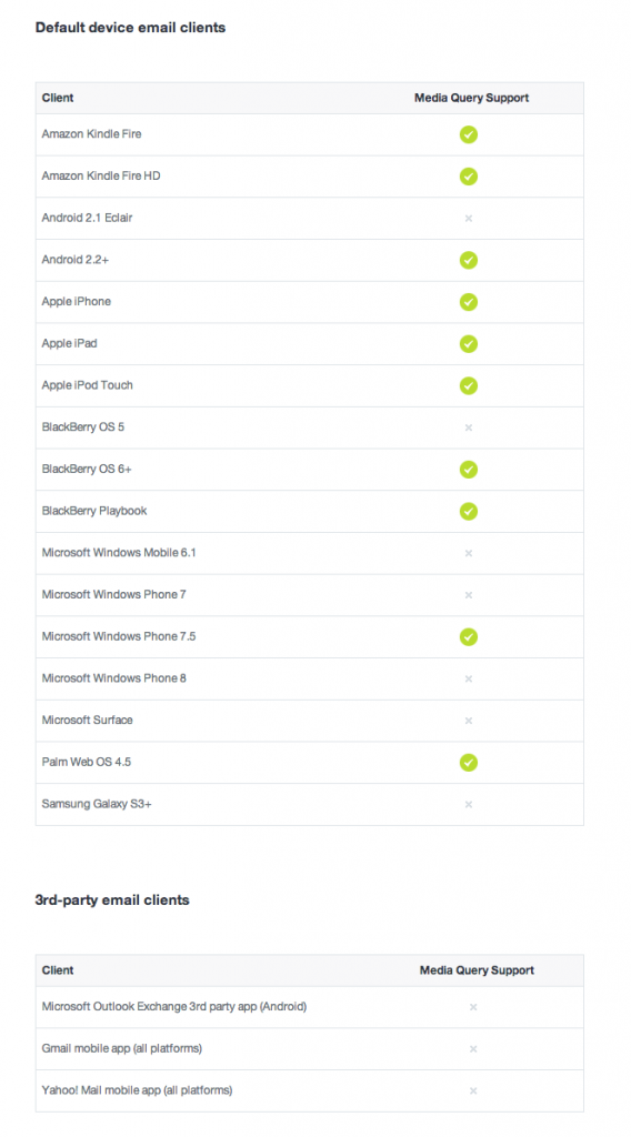
But why is this? We’ve seen that it is responsive on desktop so why isn’t it working on a mobile? Well it is down to the fact that the email was built using divs and media queries and quite simply there is very little support for media queries out there…
We design our emails with mobile in mind. We don’t use divs and more importantly we do NOT use media queries. If you are interested in having a responsive email designed and built, contact us here.